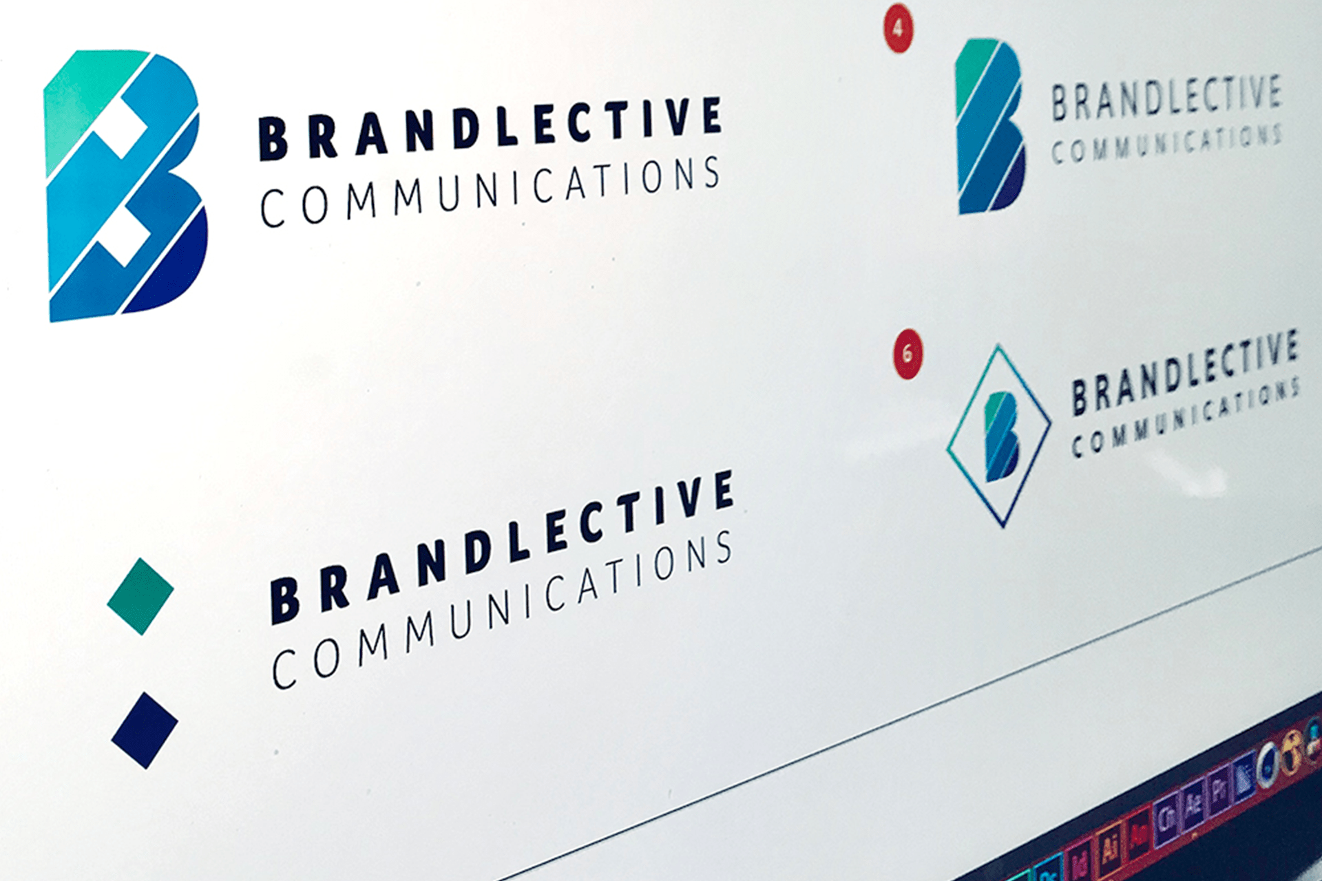
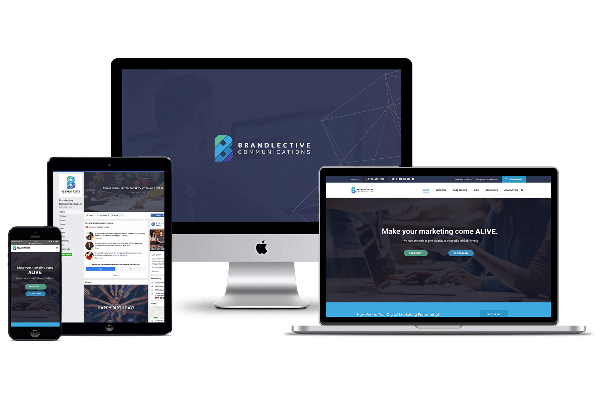
This project started out as a light rebrand that then became a whole identity system including a set of brand guidelines for their team and resulted in a logo that will stand up to the test of time and not just conform to a style trend.
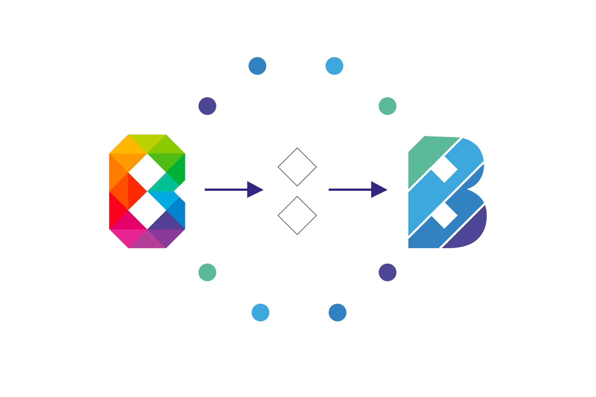
When we looked at the old logo, we realised a similar resemblance to a generic type of logo that could be bought on any asset-sharing platform. What we decided to do was take the elements that were recognizable and give the brand a new typeface.
The features we kept were the diamond shapes in the ‘counters’ of the letter B (the 2 spaces in the middle). We also decided on using the colors of the first logo but splitting the palettes into primary and secondary options. This way it’s easier on the eye and it’s easier to create more simple, and stunning imagery with the graphics than with too much information.
Overall, the brand is recognizable, easy on the eye and clean. These are key features when it comes to brand recognition and good design.